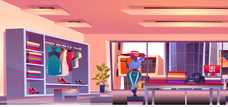
What is Visual Merchandising, and what does it entail?

What is Visual Merchandising, and what does it entail?
People
are usually irritated and uncomfortable when they listen to visual
merchandising. Retailers are aware that it is a critical retail title, but they
are unsure of what it is or how to execute it effectively. It can make you
wonder where to start. Creating visual displays can be extremely difficult when
you're both artistically challenged and monetarily strapped. However, here are
the top five visual merchandising aspects. They're simple to implement, won't
deplete your bank account, and, most significantly, will help you increase your
transactions.
The
influence of good visual merchandising on the customer experience in your store
is enormous.
These
five criteria can help you achieve more substantial and spectacular visual
merchandising whether you're updating your shop designs or creating new ones.
Also, this year, increase your savings.
Color
Is Majesty, Always Remember That
Color
is crucial to your visual displays, and it can make or break them. Even if a
merchant creates an unusual collection, the display can still be beneficial if
the colors blend properly.
Make
a focal point for visual marketing.
Examine
your display from the top, bottom, and all sides, as if you were a consumer.
The main point is frequently set too high for the client to view. Always
double-check your displays to make sure buyers can see the hotspots and
merchandise, as hotspots can increase sales by 229 percent.
Add
motion to the display.
It's
easy to focus solely on the colors and forms of the display, but you can take
it a step further by adding flow with a fan strategically placed out of sight
to gently blow a summer dress, a toy train during the holidays, or your product
in use. Sound is usually included in the motion, which is an added bonus.
Change
the displays but not the fixtures.
When
new merchandise arrives, reposition existing displays on the sales floor.
Change your store design two weeks after landing, moving one to the middle of
the sales floor and the other from the centre to the back, because the somewhat
new inventory will still be selling.
Make
Good Use of Free Space
In
every store, there is an empty spot. It's the space between the products on
display and the ceiling. You should start using this space in your store if it
is currently empty. This space can be used for a variety of purposes, such as
displaying product or brand information on signage. You can also show client
recommendations that include the customer's name as well as a designer's picture
or profile.
Finally,
The
visual commerce display contains many more components. As a result, merchants
should carefully study and plan ahead of time, as the major reaction of
customers to a shop design will determine whether the company gains or loses
customers. Please contact us if you need assistance with Visual Merchandising.
In Mumbai and Vashi, Radiance Vision offers a highly skilled team of AV service
providers.
Visit our website now:
https://www.radiancevisiongroup.com/.
https://www.radiancevision.co.in/


